GNSS Analysis interactive plots
The GNSS Analysis app provides interactive plots organized in radio frequency (RF), clocks, and measurements columns, as shown in figure.
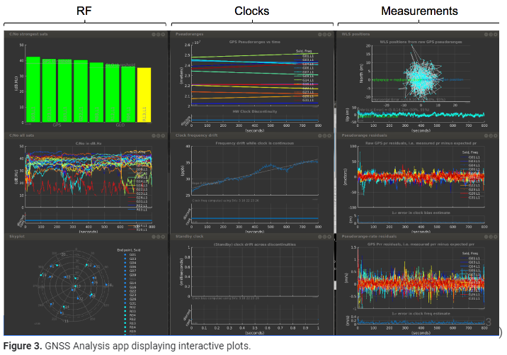
1)The RF column shows the following data:
- For each constellation, the four satellites with the strongest signals.
- For each satellite, the time plot of carrier to noise density (C/No).
- The skyplot of satellite positions.
2)The clock column shows the following data:
- The pseudoranges.
- The offset frequency of the receiver clock, which is computed using one of the following reference positions:
- Automatically computed mean position.
- Latitude, longitude, and altitude entered by the user.
- National Marine Electronics Association (NMEA) file with truth reference PVT.
- The offset of the standby clock that keeps time when the receiver resets the duty cycle of the primary oscillator.
3)The measurements column shows the following data:
- The weighted least squares position results obtained from the raw pseudoranges. The weighting is done using the reported uncertainty of each measurement, which is part of the raw measurement API spec.
- The errors of each pseudorange for each measurement.
- The errors of each pseudorange rate for each measurement.
