Using Desktop App for analyzing the GNSS raw measurements
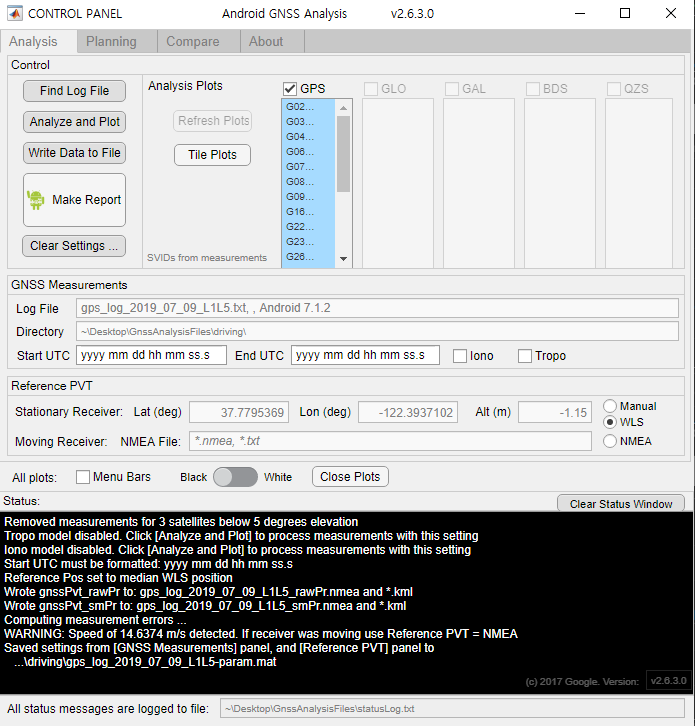
I used the Desktop app to analyze GNSS raw measurements. When I insert a text file into this program, it automatically analyzes the data and displays the graph. It takes about 10 minutes to analyze, and the data is now small enough to be analyzed quickly.
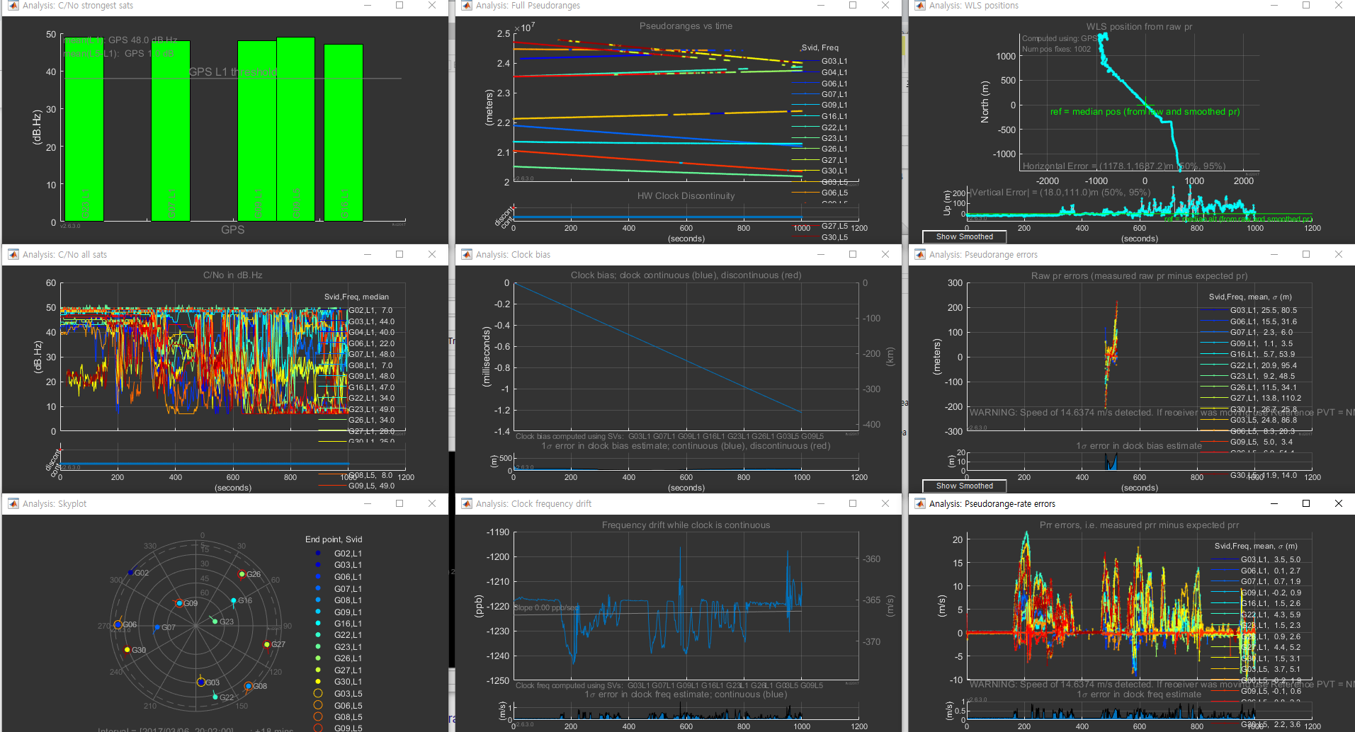
The program displays a total of nine graphs on the monitor as shown above.
According to User manual :
1) The RF column shows C/No for the strongest satellites in each constellation, as well as a line plot for all satellites. The skyplot shows all satellites in view (whether we have measurements for them or not).
2) The Clocks column shows clock information. The top plot shows pseudoranges. If there is a dramatic change in a clock (like a jump of the order of milliseconds) you will see this in the pseudoranges. The second and third plots shows the receiver clock offset and frequency.
3) The Measurements column shows pseudorange and Doppler (pseudorange-rate) measurements. The top plot shows the position from weighted-least-squares; you can think of this as a projection of weighted position errors onto the 2D horizontal and vertical planes – thus it is a way to visualize the aggregate measurement errors. The next two plots show individual measurement residual errors. The residual error is the difference between the measurement and the expected value (of pseudorange in mid plot, and pseudorange-rate in the bottom plot).
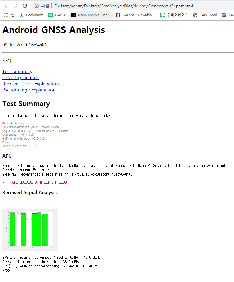
Finally, I was able to get analysis reports on GNSS data.
